This year’s livery selection is largely neat and tidy, but lacking a certain boldness across the board. After the enforcement of a new rule to prevent teams from leaving pure carbon black everywhere, I was hoping for more colours, and maybe some bolder designs. Nothing is outright ugly this year, in my unqualified opinion, but nothing takes my breath away either. What I will shout from the rooftops is just how much better proportioned these cars look compared to the last rule changes. I still think they need to be narrower to promote side-by-side racing and less argy-bargy, but this is a decent step in the right direction.
11th – Racing Bulls
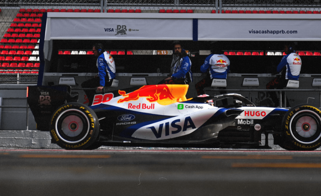
The side profile of the Racing Bulls shows off some beautiful contouring between the blue and white, but as soon as you move away from that perspective, the contouring looks too busy. I like the silky-toned off-white and how that adds natural depth and shadow to the sidepods. The Red Bull logo pops with its bold colours, but I wonder if the yellow makes it look a little gritty over the silky, luxurious palettes elsewhere. I think this will be a grower over the season.
10th – Audi
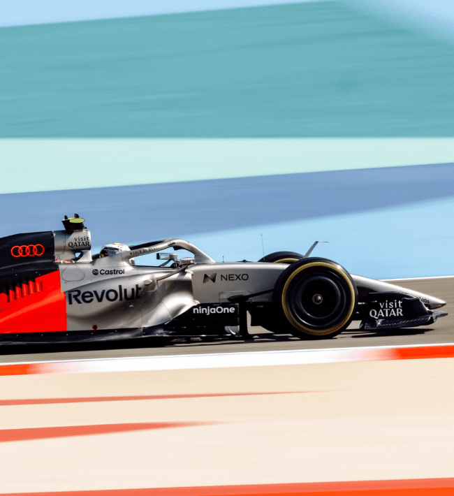
My issue with Audi is that whilst Cadillac has split the livery in a way that means you see a complete livery on either side, Audi has chopped their liveries in half. It is so aggressive that I find it jarring to look at. The titanium and black look neat, but way too close to a Mercedes, and the Audi red (yes, that’s its palette name) is so striking it overpowers the front half. I love the way the Audi red looks like a mountain or a power trace around the indents, and I’d have preferred to see that two-colour approach across the whole car. I also worry that the titanium will shine back and block out the sponsors.
9th – Cadillac
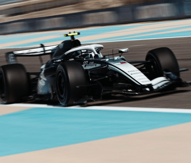
A far neater split livery. The colour fade up the nose cone and cockpit looks stylish, and there’s a general corporate elegance to it I like. It reminds me of Beitske Visser’s W Series livery when she was sponsored by Forbes, because everything about this Cadillac screams “the font is the branding”. My main concern is that a black and white car, with lots of crossfade, is just going to blend into the background. It just needs a colour accent somewhere… anywhere… then I think it’d shoot up my rankings.
8th – Williams
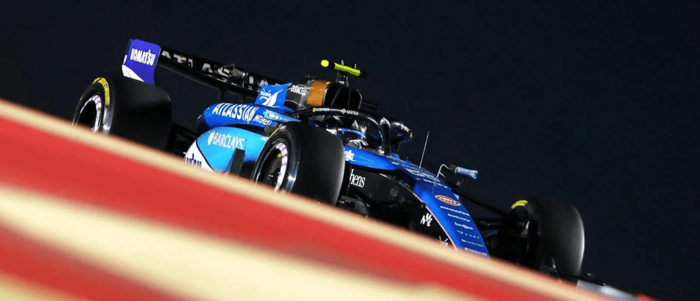
The Duracell part is still genius, especially in a year where it feels like the word “battery” will be said more than the word “racing”. In a similar vein to Racing Bulls, the Williams is trying to do too much with its segmentation lines. Clearly, they’ve got a lot of sponsors with content guidelines to meet, and so this could have been a whole lot worse. If the light blue of the Barclays matched the rest of the darker Blue, this would be a winner. It looks better out on track than it does in stills. I feel like a Ligier had co-joined triplets, and this is the end result.
7th – Mercedes
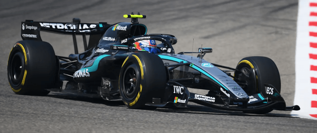
The Petronas electric blue adds a much-needed accent to the silver Mercedes, which is a tidy-looking livery… except for one thing. The sidepod lettering on the Petronas logo doesn’t align with the sidepod! The PET slightly peaks out over the top of the sidepod, whereas the NAS rolls underneath the harsh cut of the underbelly. As a result, it looks wonky, and it is driving me to distraction. Please, please, realign it! Lovely otherwise, though.
6th – Aston Martin
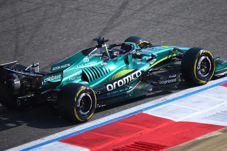
Aston Martin’s deep green is beautiful, and unlike the Mercedes, the Aramo logo wraps the sidepod far more neatly. The luminous yellow streaks look lovely, and the sans-serif fonts around the car are oddly satisfying and feel classy. I feel like Aston Martin has locked into their standard design now, and this is a quietly beautiful classic.
5th – Ferrari
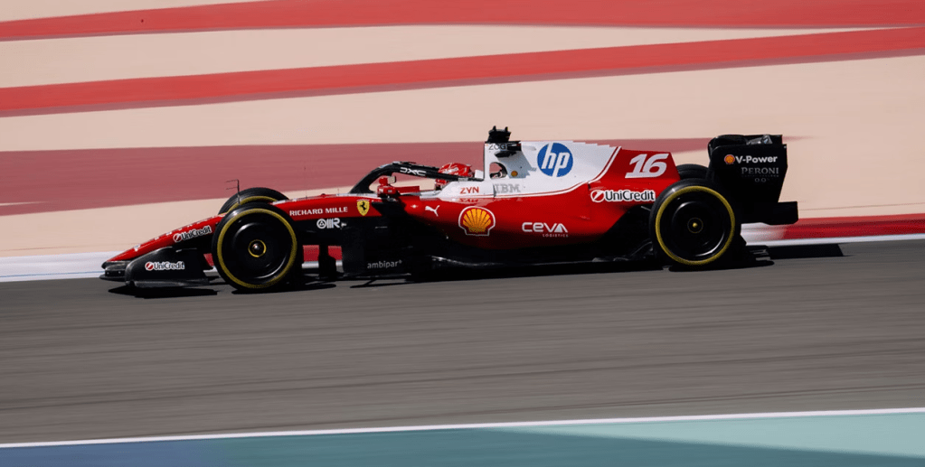
The red is richer and more potent, and it needs to be. The retro white blob around the driver, added to help make the HP logo look less jarring than last season, does help solve that issue, but in doing so, it creates another. Charles and Lewis will not see much Ferrari red in the cockpit, and we are denied a fully Ferrari red car. I think they’ve done a great job on what is a branding nightmare. I’m not sure how they’ll get it to look stylish if they want to bring back the Monza yellow…
4th – McLaren
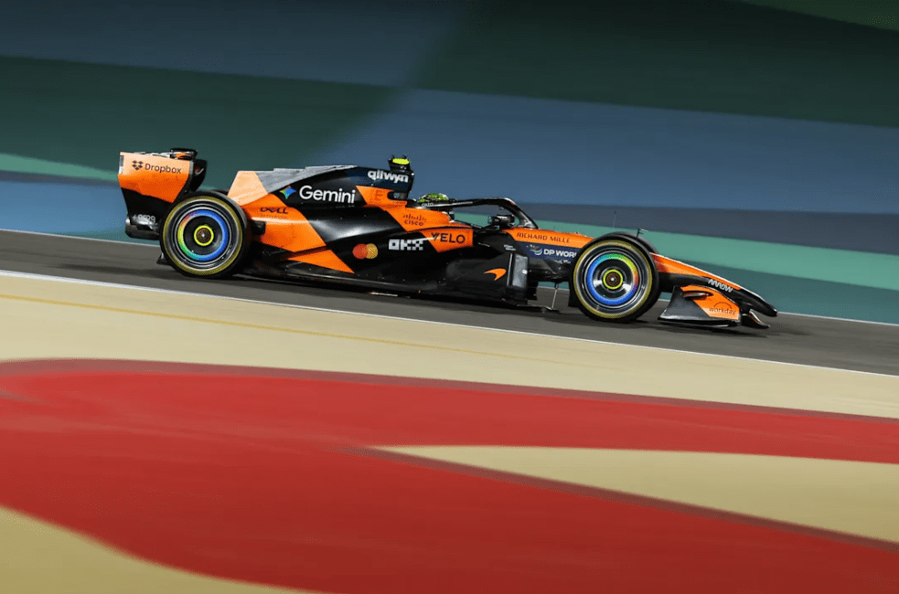
This livery has grown on me the more I see it. I love the papaya and black combo, and the Google wheels are fun. My initial concern was the diagonal framing. It looks great side-on, and the car looks beautiful from the top down. It’s whenever you are in other positions, the car looks a little less elegant and together, as the striped design looks slightly bobbled. Now I’ve seen it in action, it’s rare that a camera makes the slants look strange, and so my worries have been calmed. Long may papaya stay on the cars. We need the colour!
3rd – Alpine
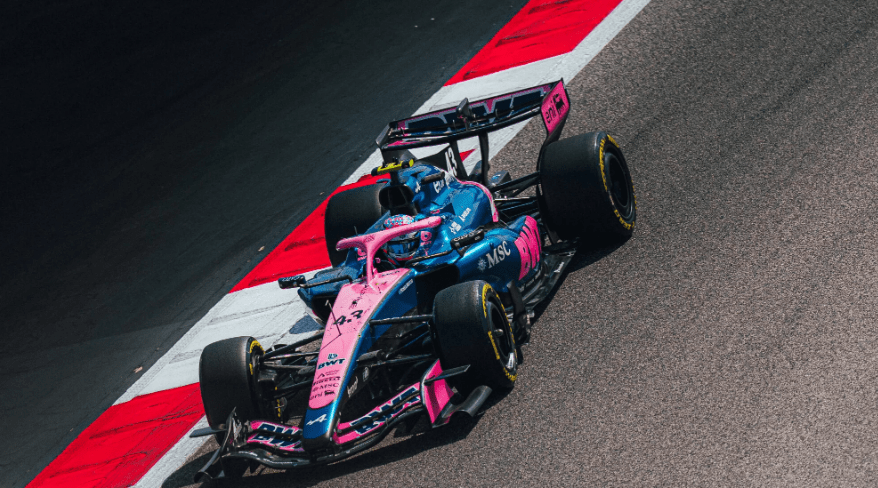
Speaking of colours… I can’t tell if it’s because in a year of silver, black, and grey, this year’s Alpine pops more than usual, or if it’s because the colour blocking relies on inverting two bold colours so often that it works even better than before. Either way, I’m delighted this bonkers colour scheme is still around and making waves. The all-pink liveries are still great, too.
2nd – Red Bull
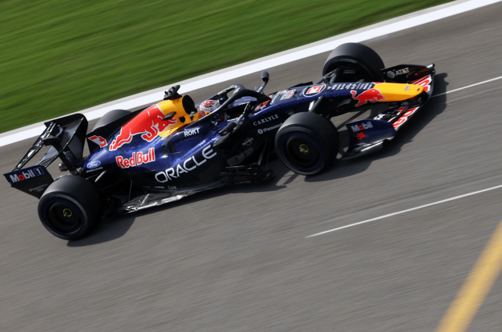
What a difference a shade of blue makes! If you’d have told me the Red Bull would be 2nd on this list before any liveries were revealed, I’d have scoffed. The rich, vibrant blue looks fantastic in the Bahrain sun. Not since the days when there was a purple tint on the main colour have I enjoyed this livery more, and the tiny mottled detailing sets it off. The bluer tint of the main palette also helps balance the red and yellow of the Red Bull logo in a way the Racing Bull’s white doesn’t. My surprise “ooh” of the year.
1th – Haas
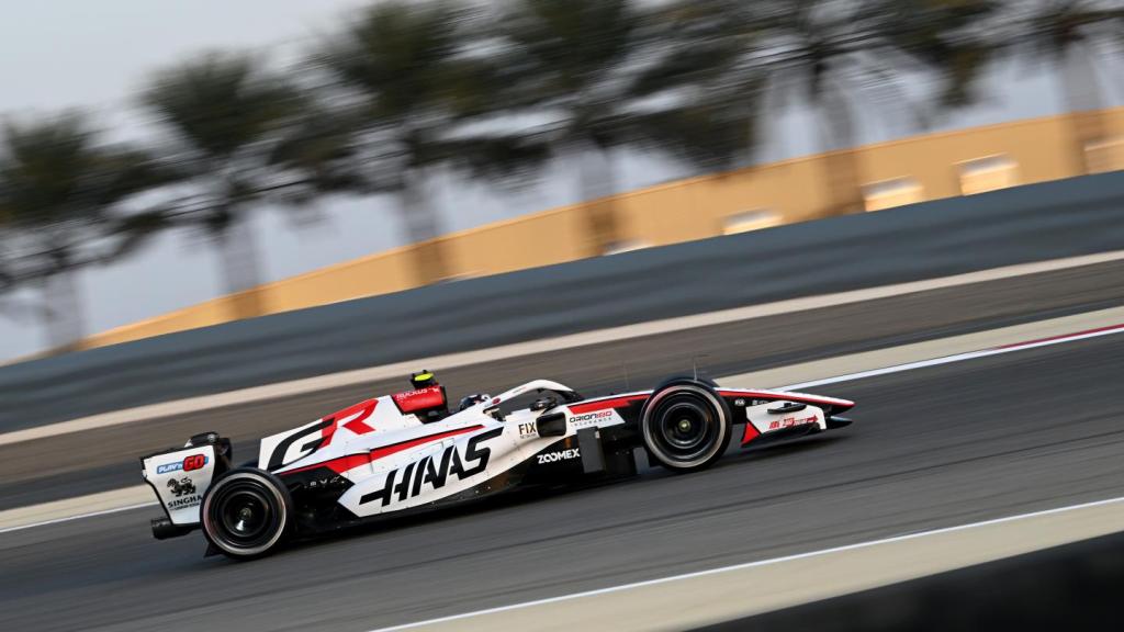
Aggressive, clean, contoured, and stylish. This is the love child of a Super Aguri and a Haas, and I am here for it. Typography is a huge part of a livery these days, and Haas gets that spot on with the stretched, speed-implied Haas and GR. Similar to Aston Martin and Mercedes, Haas uses its accent colour around the sidepods, but crucially, there are no fades and crossovers. These are slices that stay above folds, never crossing over, and they create an aesthetically pleasing beauty.
The Haas is by far my favourite livery of 2026. Again, I’d have laughed at that prior to launch. What are your favourites?

Higher Plain Racing is part of the Higher Plain Network – a one-man indie media project. If you like what I do, please consider supporting me on Patreon for as little as $1/£1 a month. In return, you’ll receive additional perks for supporting me, such as behind-the-scenes content and free downloads. You can also donate using PayPal. Sharing the website helps too. All your support will enable me to produce better content, more often. I’d love to make this a full-time media network and your support can make that happen. Thank you.
Discover more from Higher Plain Racing
Subscribe to get the latest posts sent to your email.
